Hi, I'm Vivek! (he/him)

that's [ viv-ake ]

I'm passionate about analyzing and telling stories with data.

About me

I work with clients to design data visualizations, dashboards, websites, and digital tools that communicate complex ideas in simple ways.

I believe in taking a user-centered approach when visualizing data. This involves lots of research, testing, and rapid prototyping. I also think it's critical to collaborate with developers while designing. I'm comfortable using Figma, d3.js, React, Tableau, PowerBI, Python, SQL and more.

Outside of work, I'm passionate about biking, painting, journalism and ethical AI. Reach out to me if you'd like to chat about those things or about any of my projects below.

Oh, and one more thing. I love puzzles and do the New York Times' sudoku (almost) every day. I last did it on 4/29/2024 and finished it in 3:19.

Awards

First, data visualization: Society of Professional Journalists

First/third place, interactive graphic: Columbia Scholastic Press Association

First place, best journalism website: Indiana Professional Chapter of the Society of Professional Journalists
Second place, informational graphic: Indiana Collegiate Press Association

Data visualization:

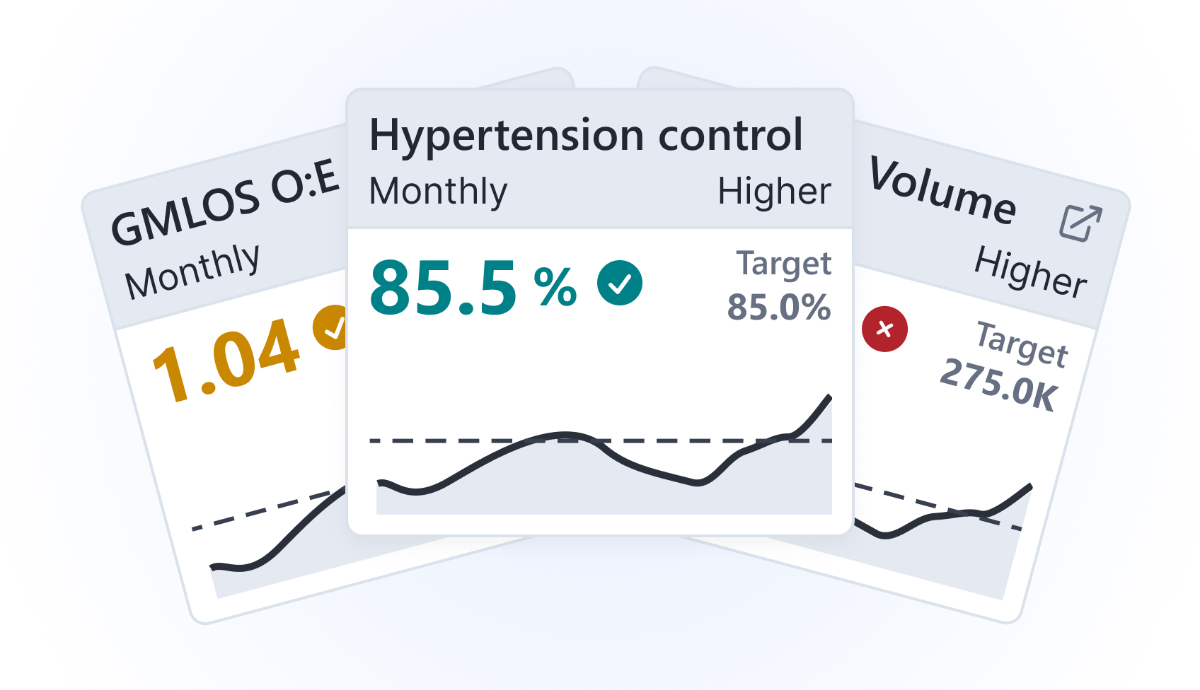
Supporting a health agency monitor 300+ nursing homes through data viz

Figma user testing Tableau AWS Python

I worked with a designer and a Tableau developer to help create two dashboards for a health agency. I designed and conducted user research for an internal dashboard that the agency uses to identify nursing homes that need intervention. I also got to work with AWS and Python to create a data pipeline that populated the dashboards.


Examining philanthropic funding for racial equity across the United States

data wrangling Figma bivariate choropleths scrollytelling

For this piece, I worked with data scientists to identify counties in the U.S. that received less philanthropic aid relative to need. We used bivariate choropleths and scrollytelling to explain the project's methodology.

This piece was special to me because I was on the founding team for an affinity group in the McKinsey Boston office to promote social mobility.


Analysis of campus utilities finds fountain wasting 10 million gallons of water

data analysis dashboarding Plot.ly geocoding Mapbox

For this story, I learned how to ask hard questions. I was at the university's physical plant at least twice a week to press the assistant director on how they hadn't discovered the leak.


What’s the best time to do laundry on campus?

data analysis cron jobs Plot.ly Python web scraping

Set up my first data pipeline and created a slackbot to alert team if there was an issue while scraping.


Digital stories:

IU found a professor sexually harassed a freshman, allowed him to continue teaching

creative direction deadlines responsive web layouts

Designed and developed a longform piece that uncovered how an IU professor was allowed to teach despite exhibitng “a concerning pattern of singling out certain students” and sexually harassing them.


idsnews.com [redesign]

project management Adobe Creative Suite responsive web layouts

On this project, my team and I asked questions from “How big should this font be?” to “How do we give underrepresented voices more space on the homepage?”

Data science:

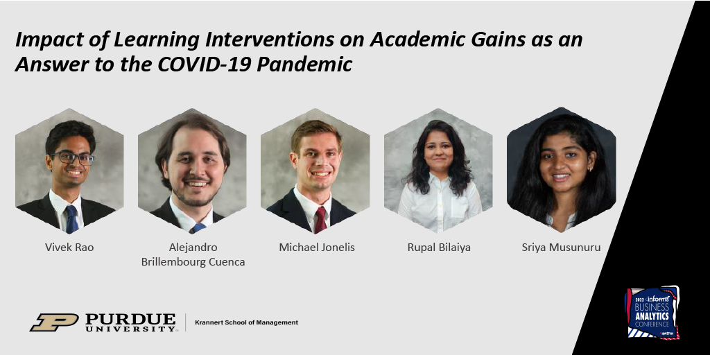
Measuring the effect of tutoring on various student groups in the COVID-19 pandemic

dimension reduction (UMAP) documentation Asana

My practicum project for my master's program, my team and I worked with a local school district to measure the effect of various tutoring interventions on student academic performance. We used difference-in-difference and 2SLS models.

My role on the team was to use dimension reduction to identify different student groups based on learning and demographic features. Our paper and poster were featured in the Midwest Decision Sciences Institute (MWDSI) and 2022 INFORMS Business Analytics conferences.


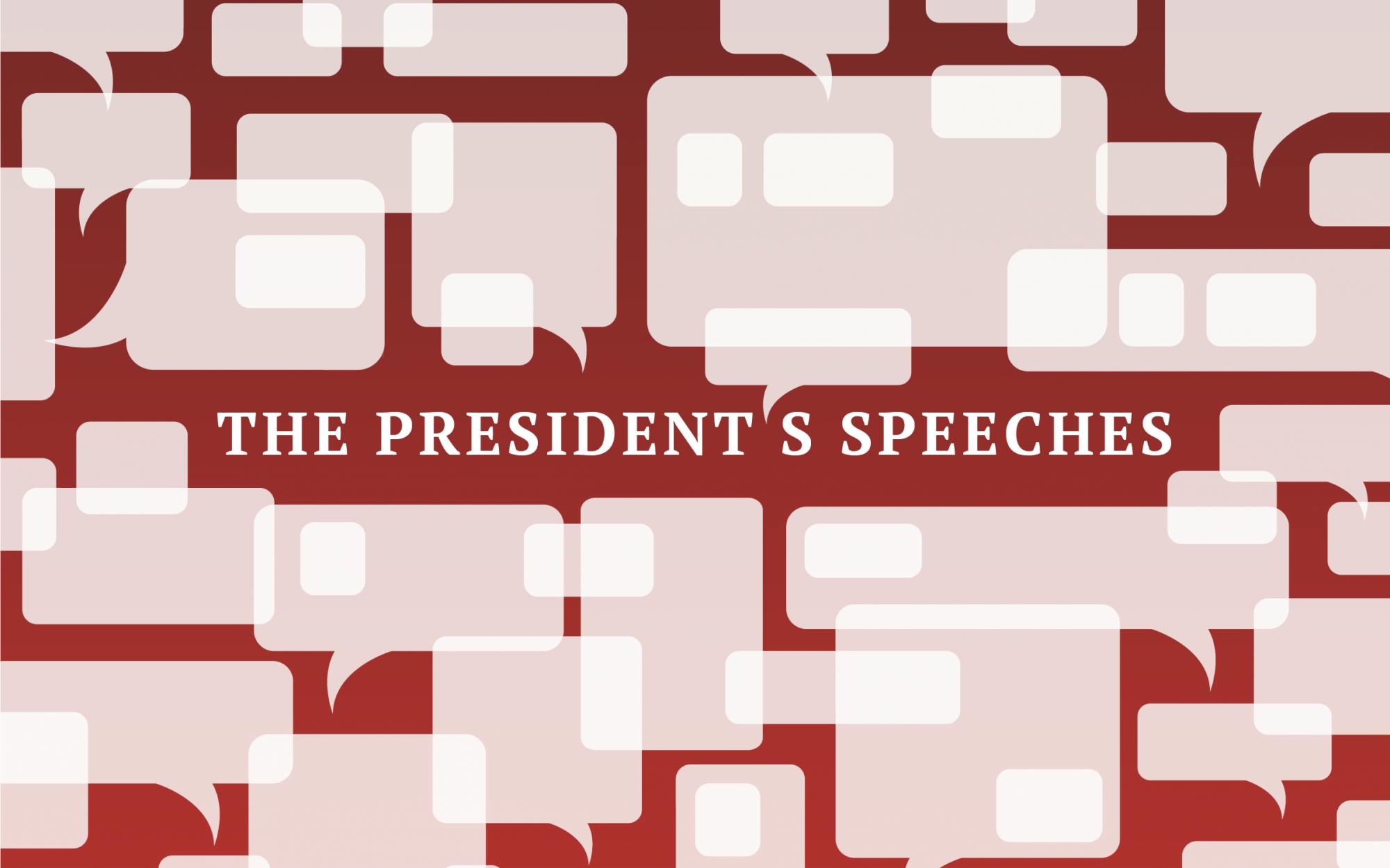
Using machine learning to simulate, analyze outgoing IU president McRobbie's speeches

fine-tuning LLMs scikit-learn nltk web scraping

Fine-tuned OpenAI's GPT-2 to simulate speeches and also visualized insights through responsive graphics.

My first foray into natural language processing, I learned a lot about machine learning and best practices when writing code. I got to work with dimensionality reduction, string analysis, data cleaning and more.

Data engineering:

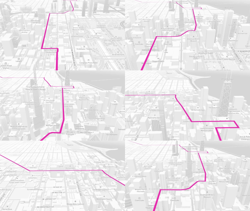
Tracking coronavirus cases in Indiana

Python cartography data viz

Created and managed Indiana's first coronavirus tracker — even before the state health department.